
Overview
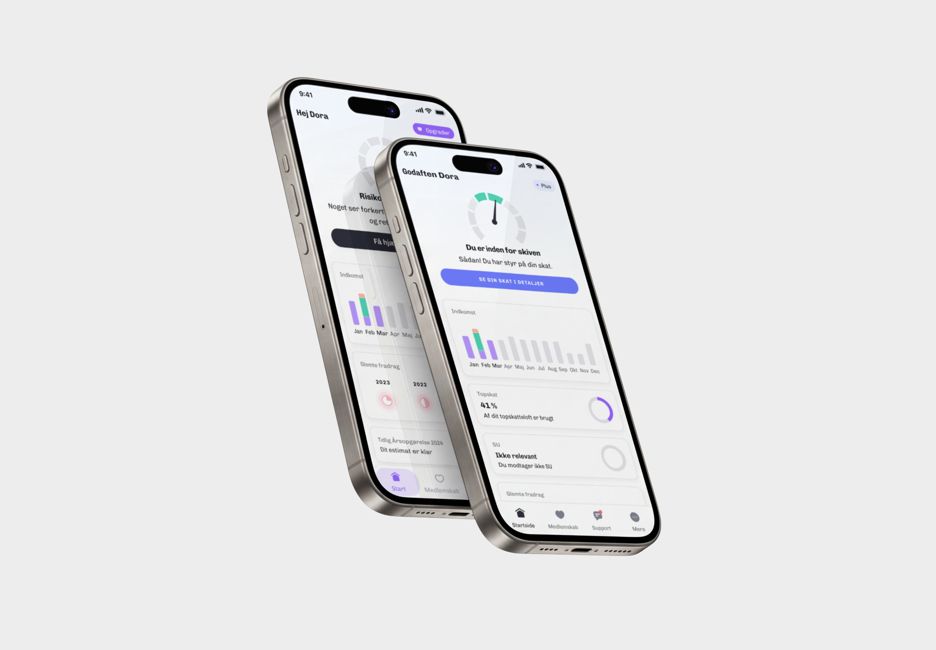
Skatteguiden helps Danes check they're paying the right tax. As PM and one of two designers, I owned framing, hypothesis, and scope, and shaped the redesign with our product designer. We shipped it as an A/B test: cutting the dashboard to a single tax-state-aware call to action lifted both engagement and paid conversion.
Problem
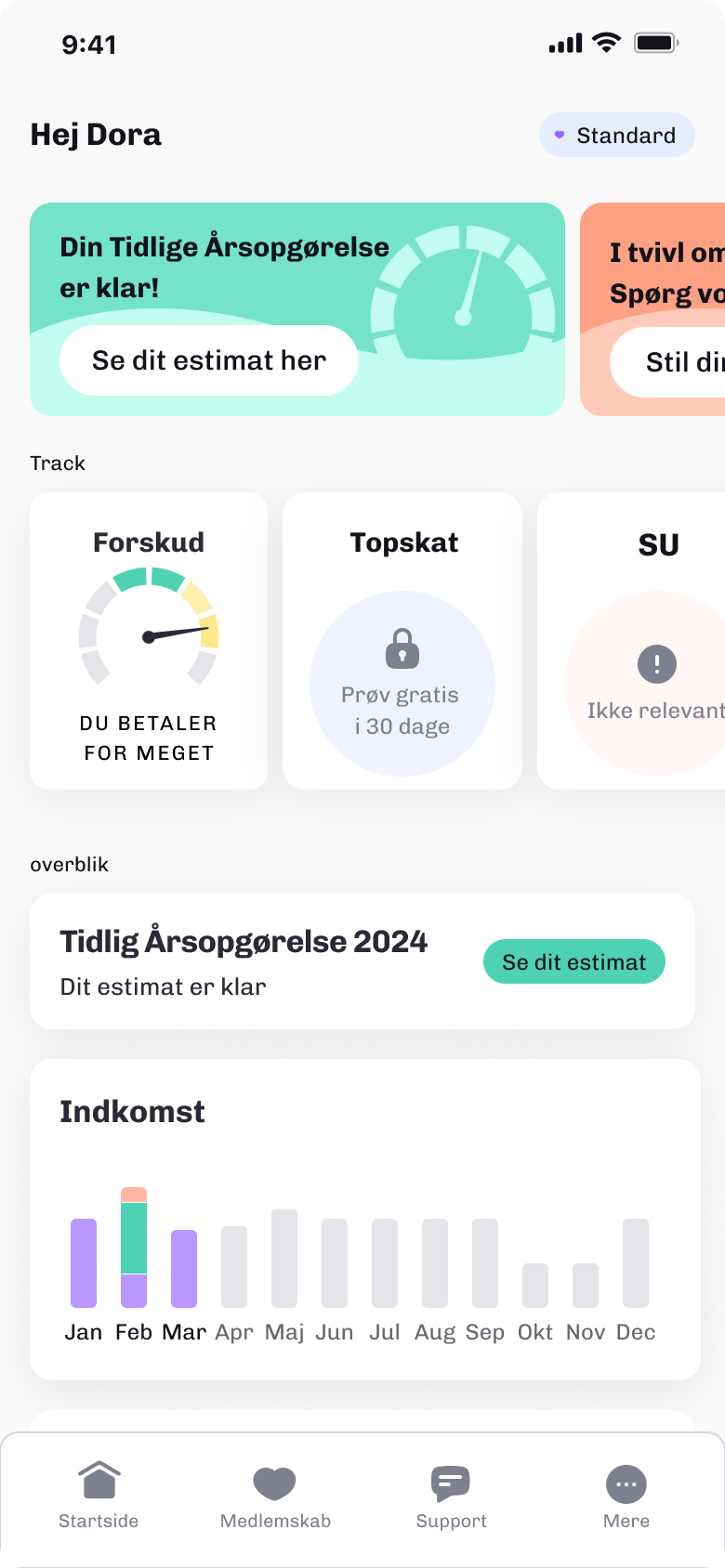
The dashboard was the first thing every logged-in user saw, and it tried to say everything at once:
- Two promo banners, a row of tax-tracking cards, an early tax-estimate card, and an income chart
- Every block the same size and weight, so nothing read as the priority
- The two revenue-driving features sat at equal prominence: the income overview (your registered income) and the tax check (flags whether your taxes are set up right)
- The tax check is what converts free users to paid, so burying it cost revenue
No hierarchy means no call to action. When everything is equally important, nothing is.
My Role
PM and designer on a small team with a dedicated product designer and engineers. I owned framing, hypothesis, scope, and structure, and ran discovery with our designer - research, survey design, ideation. I built the early wireframes and mockups and contributed to the final screens we handed to engineering.
Decisions
Cut about half the content
Before cutting anything, we needed to know which features users valued. We ran an unmoderated card sort - 140 existing users ranked 10 features by importance.
Forskud - the tax calculator that flags refund and debt risk - ranked #1 by 60%+ of users and is the feature that drives upgrades. Yet it wasn't prominent on the dashboard. The SU tracker, relevant to ~10% of users, sat in everyone's view. One respondent: "Lønmodtager Plus medlemmer har ALDRIG brug for SU tracker."
| Feature | Avg. rank |
|---|---|
| Forskud - tax calculator | #1-2 |
| Income overview | #2-3 |
| Early annual statement | #3 |
| Deduction filing | #4 |
| Forgotten deductions | #5 |
| Support | #8 |
| SU tracker (students only, ~10%) | #9 |
| My tax in society | #9-10 |
- The card sort told us what to cut: the low-ranked, narrow-audience blocks (SU tracker, tax education) that sat in everyone's view
- We kept the patterns users already knew, removed roughly half the blocks, and refreshed the UI to feel current
- Less to parse means the eye can find the thing that matters - which set up elevating Forskud to the hero next
One state-driven hero, action-first
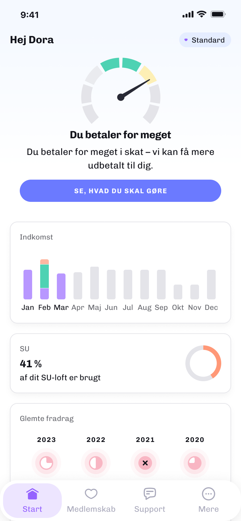
- We moved the skattemeter - Forskud's core output, a dial reading paying too little, about right, or too much - to the top as the single focal point
- The old dashboard buried it in a Track card behind a tap; the new hero states the next action inline - one fewer tap
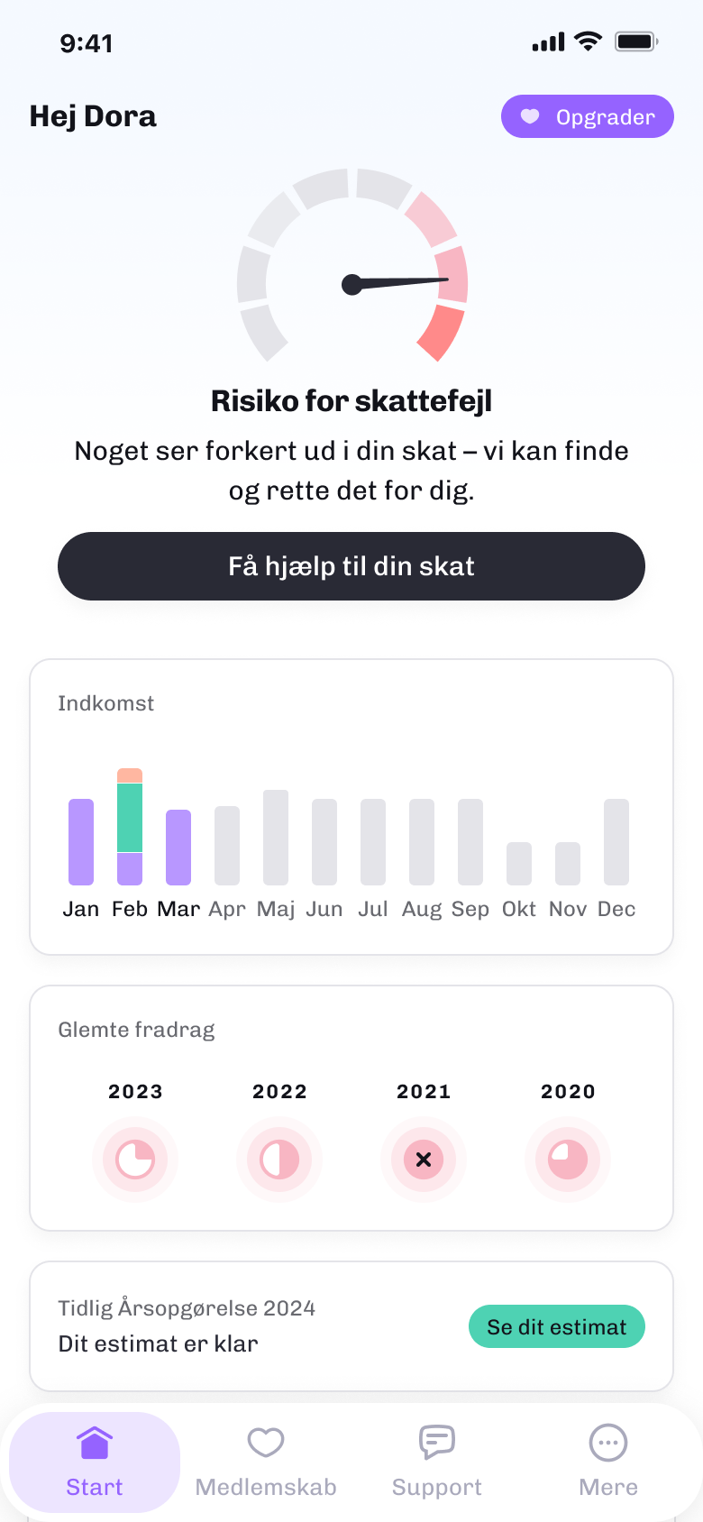
- It reads the user's real tax state - at risk, overpaying, or on track - and swaps headline and button to match. Same slot, different meaning per user.
The call to action changes label and meaning by the user's actual tax situation. The "what do I do now" is answered before they ask.
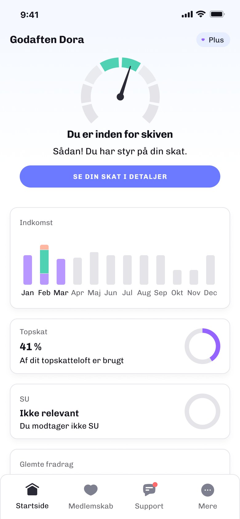
We tested the hero with real users first:
- Skatteguiden runs a user panel - ~500 people opted in to test new features
- Via Lyssna, quick surveys on clickable prototypes: did people understand the meter? was the next step clear?
- Fast turnaround let us refine on real comprehension, not internal opinion
The panel is biased - opted-in, already-happy users - so we treated it as a comprehension check, not proof of demand. For "do people get this and know what to do next," it was the right signal.
Personalize by membership tier
- Tier determines feature access, so it also determines what's worth showing
- Freemium sees the essentials; Standard adds an SU card; Plus gets the full set including Topskat
- Nobody sees a locked feature dressed up as an upsell in the main flow - the screen shows only what's relevant to you
A darker call to action for freemium
- Members get the standard purple action button; freemium users get a darker, upsell-flavored one that leads into the paid upgrade flow
- One slot, double duty - a next action for members, a conversion entry for free users - with no separate "upgrade" block
Measuring it when the tooling fought back
- PostHog was mid-implementation and its data wasn't yet trustworthy
- Rather than fly blind, we ran it as an A/B test and I manually exported PostHog feature flags into Braze to measure against a clean source
- Not elegant, but the 100% rollout was backed by real numbers, not a hunch
PostHog feature flags
assigned the A/B groups
Braze
clean engagement + sales tracking
Outcome
The new dashboard won the A/B test and rolled out to 100%. Engagement and paid conversion both climbed:
- +14% more users reached the income overview - the biggest lift
- More members opened the tax check, though the number who actually ran one held flat
On the free side, where the business case lives:
More opens of the tax check didn't mean more checks actually run - I read the extra opens as curiosity, not new intent.
Lessons learned
- Push for trustworthy analytics before shipping, not after. The manual Braze export got a decision, but clean data would have let me segment by tier and tax state and learn far more.
- Hierarchy is a feature. The biggest win came not from new functionality but from removing content and making one action obvious.
- One slot can serve two audiences. The tier-aware hero and the freemium button color let a single component drive both engagement and conversion without adding clutter.